
Ideas for booths usually start the same way. You book the space, look at the floor plan, and realize your brand is about to sit in a row of booths that all blend together. The result isn’t just disappointing. It costs conversations you should have had. Naturally, we have plenty of trade show booth examples.
The strongest ideas for booths don’t start with a table, a backdrop, and a logo placement exercise. They start with a question: what should someone feel, understand, and do in the first few seconds they see your space? Once you think that way, the booth stops being a container and becomes a working brand experience.
Your Guide to Unforgettable Trade Show Booth Ideas
Most exhibitors know the pain point. You spend on the show, ship materials, brief staff, and show up to a hall full of visual noise. Then attendees walk past because your booth looks like a dozen others nearby.
That reaction is predictable. 76% of trade show attendees say booth design influences their decision to visit a booth. Design isn’t decoration. It’s the first filter attendees use to decide where their time goes.
The practical implication is simple. If your concept can only live on printed panels, you’re limiting what the booth can do before the show even opens. The better approach is to treat the structure itself as media. A continuous LED wall can become the background, the product stage, the brand signal, and the directional system all at once.
What ideas for booths actually makes an exhibit memorable
A memorable booth does three jobs at the same time:
- Stops traffic: It creates enough visual contrast to break the attendee’s autopilot.
- Explains quickly: It communicates what you do without forcing people to read a wall of copy.
- Supports sales conversations: It gives your team a setting that helps demos, qualification, and follow-up.
That matters even more when you’re planning a larger footprint. Booths sized 20×20 and above attract 2x more visitors than smaller ones in the same source above, which makes the quality of the experience inside that space even more important.
Practical rule: If a booth idea only looks good in a render and doesn’t help a real visitor understand your offer faster, it isn’t a strong idea.
The exhibitors who get the best results usually make one shift early. They don’t ask, “What graphics should go on the wall?” They ask, “What should the wall do?” That change leads to better concepts, clearer layouts, and stronger content.
The best LED-driven ideas for booths are built from the start around motion, scale, and flexibility. Curves, corners, counters, columns, and full-height surfaces can all become part of one visual system. That opens the door to booth ideas that static builds can’t execute cleanly.
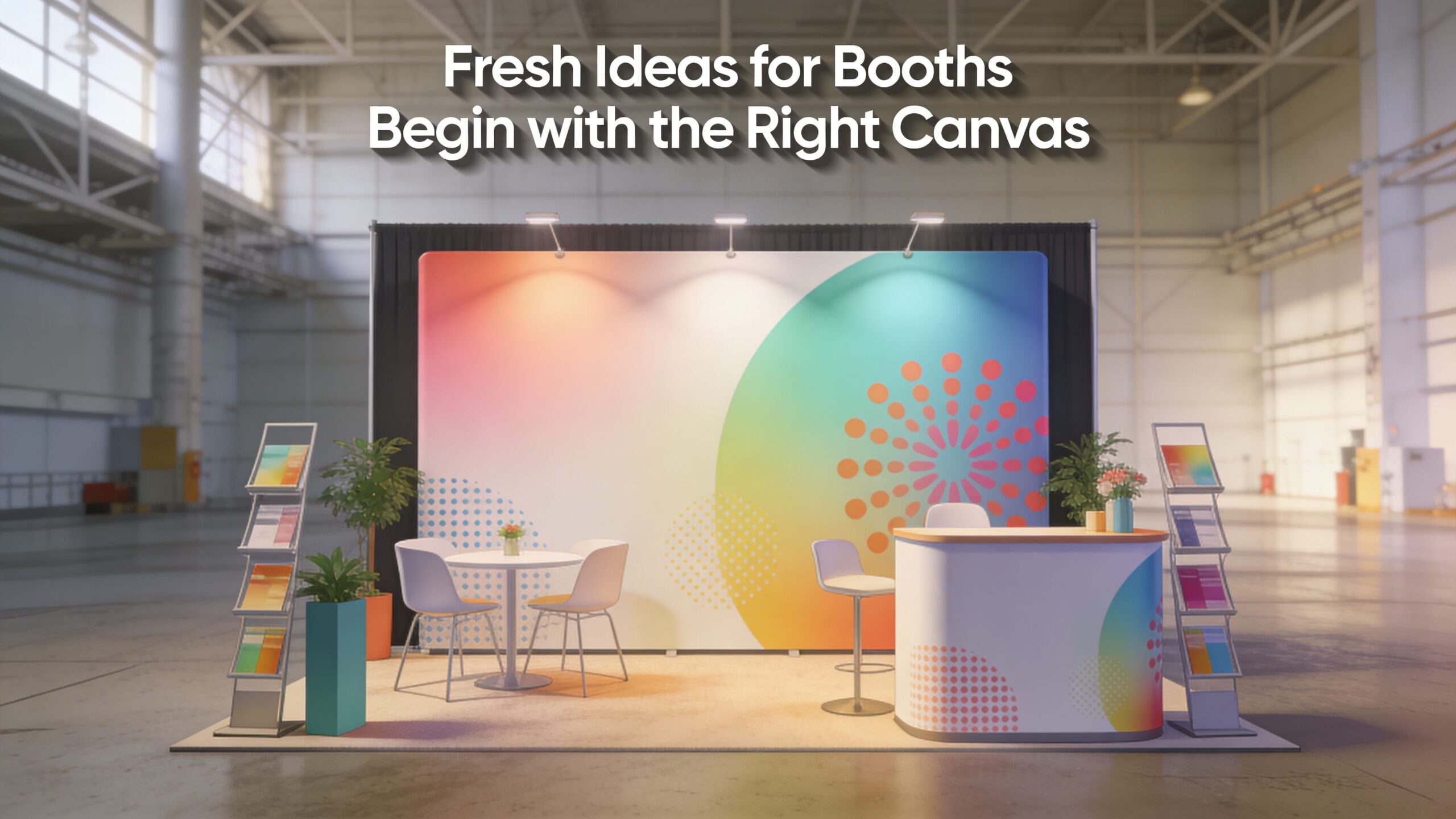
Fresh Ideas for Booths Begin with the Right Canvas
A good booth concept doesn’t come from collecting random features. It comes from choosing the right canvas first. If the structure can only support flat printed graphics, your thinking gets boxed in. If the structure itself can display motion, depth, texture, and responsive content, your concept options expand immediately.
The most useful way to generate ideas for booths is to work from concept models, not decorations. That keeps the idea tied to visitor behavior instead of surface-level styling.
The immersive environment
This model turns the booth into a place, not just a display. A cybersecurity company can surround visitors with animated threat maps and system visuals. A manufacturing brand can simulate a factory line or place attendees inside the product workflow. A wellness company can create a calm, low-noise atmosphere that feels different from the aisle outside.
This works because the LED wall isn’t acting like a television bolted onto a booth. It becomes architecture. Curved walls, entry portals, and digital backdrops all support the same story.
For teams refining the look and feel, it helps to review core visual branding principles before content production begins. Strong visual systems matter more on a large LED surface because inconsistency becomes obvious fast.
The interactive digital playground
Some brands need attendees to do something, not just watch. That’s where an interactive concept works well. Visitors can trigger product reveals, explore use cases, scan QR codes tied to zones, or activate on-screen comparisons through touchpoints or guided demos.
The mistake here is making interactivity feel like a gimmick. If the interaction doesn’t reinforce the product story, it creates crowd noise without sales value. The best version is simple. One action, one payoff, one clear reason to engage.
A lightweight modular wall helps because you can build the interaction into the shape of the space. A counter can become a demo station. A column can become a product selector. A side wall can become a live comparison surface.
The dynamic storytelling stage
Some products need a narrative arc. A startup launching a new platform may need to explain the problem, show the workflow, then prove the result. That sequence is hard to communicate with static signage alone.
A storytelling stage lets the booth run in chapters:
- Problem frame: show the friction your buyer already recognizes.
- Product in action: move into feature demonstration and use-case visuals.
- Proof and next step: give staff a natural point to start the conversation.
This concept works especially well when the booth has one dominant visual anchor and a clean entry path. Teams that want a compact option can look at modular pop up walls for trade shows as a starting point for scaling this idea into smaller footprints.
A booth concept gets stronger when the structure, content, and staffing plan all support the same behavior.
Design a Visitor Journey Not Just Random Ideas for Booths
Many booth ideas fail for a simple reason. They look exciting in elevation, but they don’t work at floor level. Attendees don’t experience your booth as a rendering. They experience it while walking fast, scanning side to side, and deciding in seconds whether to step in or keep moving.
The fix is to design a journey, not just a footprint.
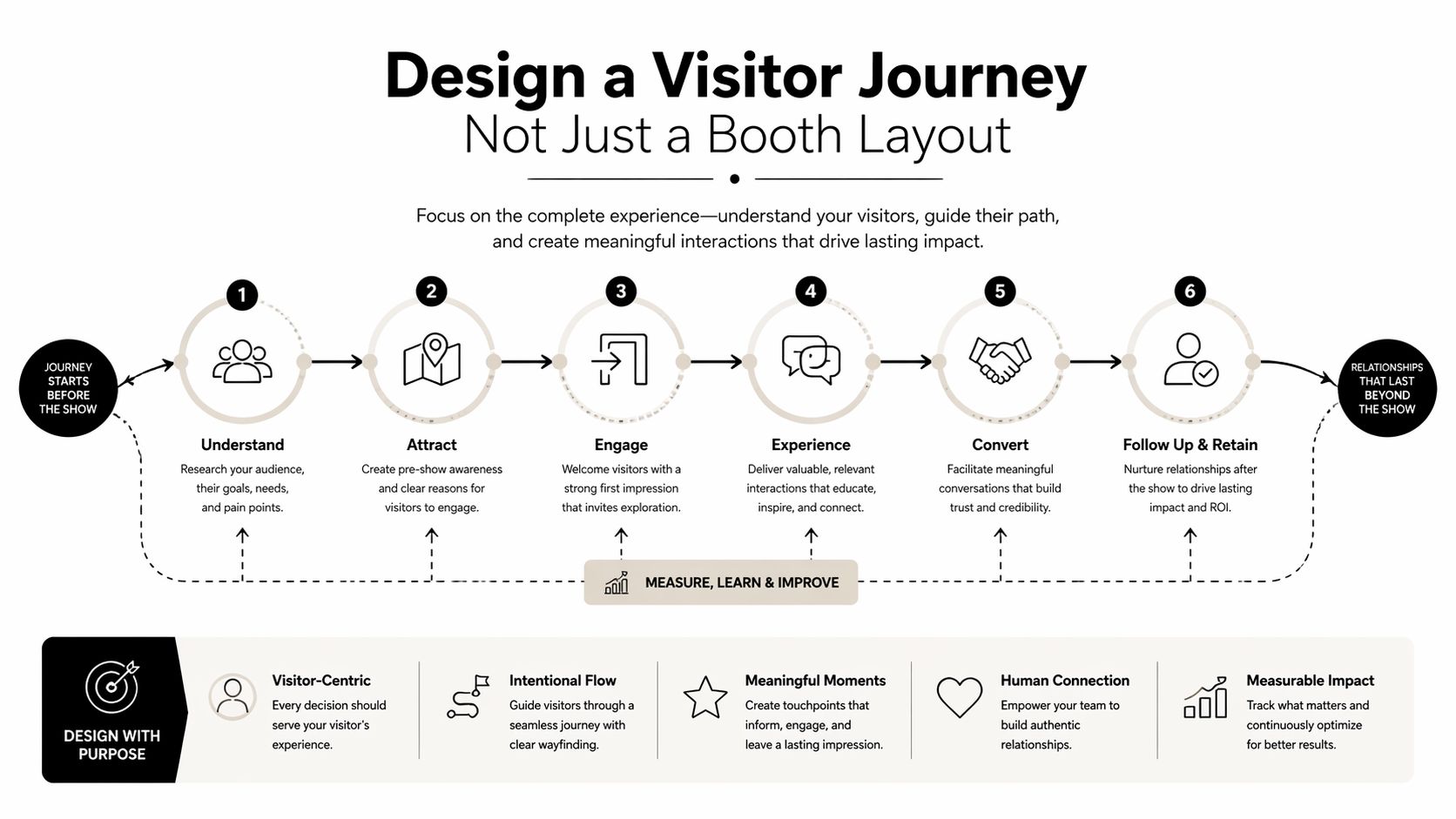
Research on trade show ROI points to a recurring gap: exhibitors often struggle to connect booth aesthetics to measurable outcomes. At the same time, friction-free layouts can boost qualified interactions by up to 40% when the space guides visitors through a planned journey instead of leaving them to wander.
Attraction zone
The outer edge of the booth has one job. It has to signal relevance from the aisle. LED surfaces are invaluable for this purpose. Motion, contrast, and scale help people understand what your company is about before they commit to entering.
Keep this zone open. Don’t choke the front line with furniture, storage, or staff huddles. The perimeter should invite movement inward.
A useful planning discipline comes from retail and interior design thinking. If you want a strong framework for circulation and functional zoning, mastering interior space planning with AI offers a helpful way to think about movement through a space.
Engagement zone
Once someone stops, the booth has to reward that pause. This is the area for product demos, touchpoints, featured content loops, and short interactions. It should feel obvious where to stand and what to look at.
The common mistake is overcrowding this area with too many messages. A tighter plan works better:
- One focal demo: Give visitors a clear center of gravity.
- One secondary support element: Add detail without stealing attention.
- One easy next step: Scan, watch, touch, or talk.
If you’re mapping options for different footprints, these trade show booth layout examples are useful for thinking through inline spaces, corners, and larger islands.
Conversation zone
Not every prospect should be handled in the aisle. Once interest is established, people need a place where the conversation can deepen without blocking traffic. This can be a side counter, a partially enclosed nook, or a quieter edge of the booth.
Keep your highest-value conversations one step away from the aisle, not buried at the back.
That placement matters. Too exposed, and serious prospects won’t linger. Too hidden, and staff won’t transition people there naturally. The best conversation zones feel like a continuation of the experience, not an afterthought added with a café table.
Create Unforgettable Content for Seamless LED Walls
A premium LED booth can still underperform if the content is weak. Hardware gets attention. Content earns the conversation. If the wall shows generic stock video, overloaded slides, or low-resolution graphics, the booth loses credibility fast.
Resolution matters here. Our pitch is 1.9, while many competitors sit at 2.5, which means the wall presents a sharper image at closer viewing distances. In practice, that means clearer text, cleaner product renders, and a more polished look for motion graphics on the show floor.
Use three content layers
The strongest ideas for booths separate content by job, not by department. That prevents the wall from turning into a dumping ground for every brand asset.
Here are the three layers that work best:
- Ambient content: This sets the visual mood. It can be subtle motion, environmental visuals, branded textures, or slow product atmosphere.
- Attraction loops: These are short sequences designed to catch the eye and explain the offer quickly.
- Interactive or staff-led content: This supports real conversations, demos, and specific walkthroughs.
The attraction loop is where many brands either win or lose. It needs to communicate one message fast. If someone has to watch too long to understand what’s happening, the content is too slow or too abstract.
Design for the distance people actually stand
Trade show content has to work at multiple distances. Someone across the aisle sees shape, color, and motion first. Someone near the wall sees typography, detail, and product proof. Your creative has to hold up at both ranges.
That is one reason digital execution keeps replacing static materials. 36% of exhibitors are ditching printed materials for digital, and the same source notes that consistent branding boosts recall by 80%. Uniform surfaces support that consistency far better than a patchwork of standees, monitors, and printed panels.
If your team needs a basic refresher on display quality, this guide on how to optimize your video resolution is worth reviewing before final export decisions.
What works and what doesn’t in ideas for booths
Take a look at what works:
- Bold hierarchy: One main message visible from a distance.
- Motion with restraint: Enough movement to attract attention, not so much that the booth feels chaotic.
- Readable typography: Short lines, strong contrast, generous sizing.
- Content built for the structure: Curved walls, counters, and tall surfaces each need different creative treatment.
Now let’s see what doesn’t work:
- Presentation decks on loop: Slides made for conference rooms rarely work on an expo floor.
- Tiny product labels: If people need to stand still and squint, the design failed.
- Unrelated videos: Visual noise may attract a glance, but it won’t support the sales team.
- Last-minute exports: LED content needs testing, scaling, and calibration.
A large-format video display wall for trade shows works best when the creative team designs with the physical structure in mind from day one.
Good booth content doesn’t just look impressive. It tells your staff exactly where to start the conversation.
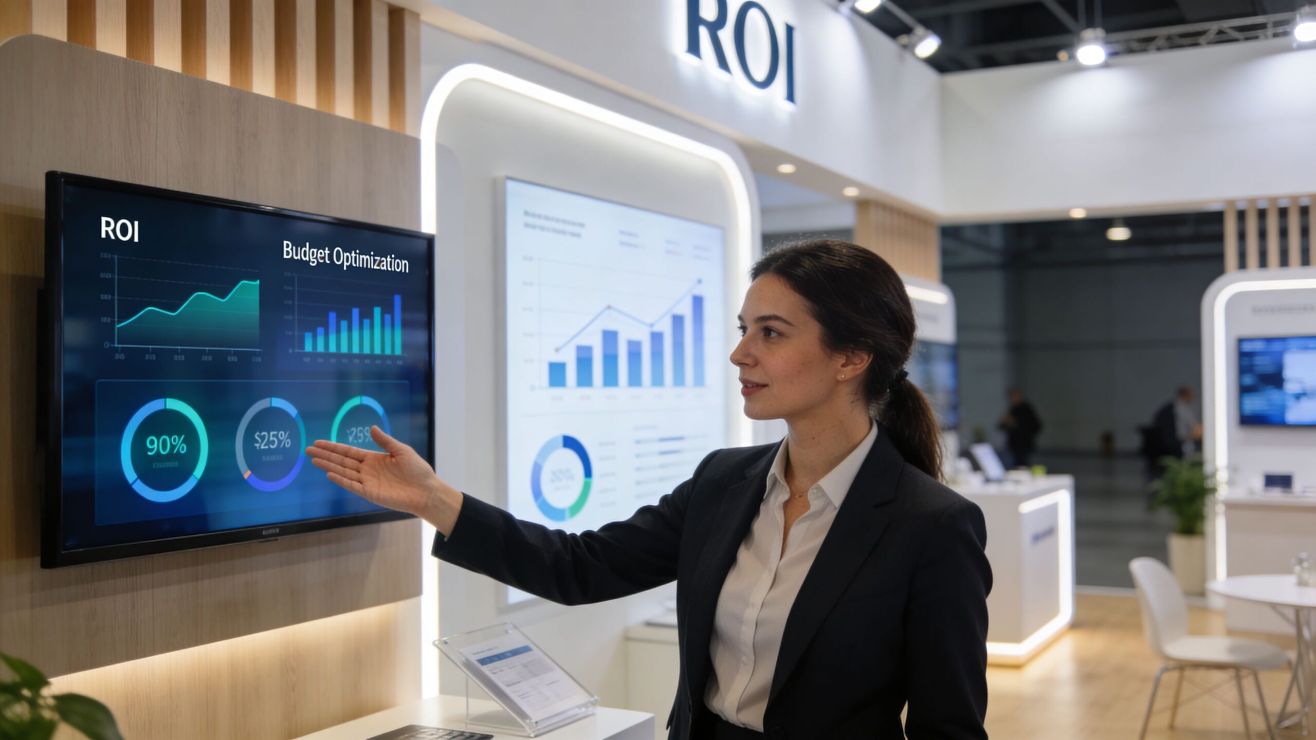
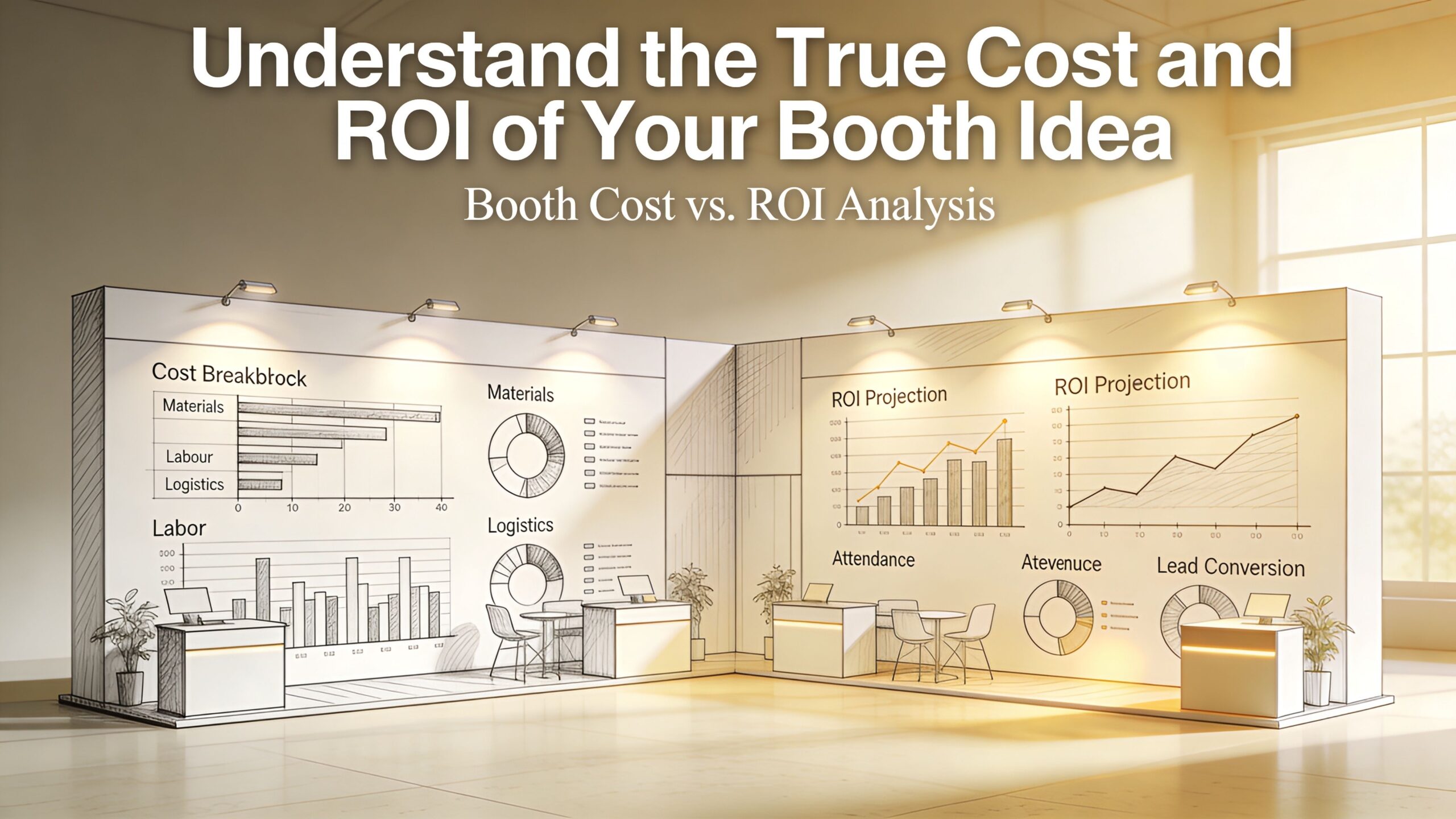
Understand the True Cost and ROI of Ideas for Booths
A lot of exhibitors compare booth options the wrong way. They line up rental prices, circle the lowest number, and assume they’re making a disciplined decision. Then the hidden costs show up. Labor changes. Drayage grows. Setup gets more complicated. Vendors start pointing at one another when something breaks.
That’s why a booth should be evaluated as an operating system, not a line item.
There is a real gap in the market here. Budget-to-impact ratios are rarely explained clearly, and exhibitors often don’t get a full picture of trade-offs before they commit. One useful framing is this: a well-integrated LED system with magnetic assembly can reduce hidden costs like drayage and labor hours, which is why a transparent cost-benefit view matters when comparing it with traditional modular systems, as discussed in this analysis of trade show booth cost trade-offs.
Compare total burden, not quoted price
When evaluating booth ideas, ask better questions:
- What is included: Shipping, install, dismantle, content support, show services coordination, and on-site help all matter.
- What is billed separately by the show: Electricity and material handling are common direct show charges.
- What risk sits on your team: If something goes wrong during show hours, who fixes it and how fast?
Here, white-glove service changes the math. A turnkey model removes operational drag from your marketing team. Instead of coordinating fabricators, labor, AV, and last-minute troubleshooting across multiple vendors, one team handles the build, logistics, setup, and support.
The hidden cost of stress
Exhibitors often underestimate the cost of uncertainty. If your screen glitches, a connector fails, or content doesn’t display correctly, your team shouldn’t be hunting down a technician while qualified prospects are standing in front of the booth.
A better setup leaves an audiovisual technician onsite for the full time the show is open. If anything needs attention, your team texts or calls and an AV technician is at the booth quickly to resolve it. That isn’t a luxury feature. It’s operational insurance.
The cheapest quote can become the most expensive booth once labor, delays, and downtime enter the picture.
The other practical advantage is pricing clarity. A strong turnkey quote includes everything except the bills the show charges directly, such as electricity and material handling. That makes budgeting more honest because your team isn’t trying to decode a low initial price wrapped around a pile of later add-ons.
For a more realistic planning view, these trade show booth cost considerations are a good reference when you’re comparing concepts, footprints, and service models.
Proven Ideas Booth Ideas for Every Space from 10×10 to Islands
The best booth concepts scale. A startup in a small inline space still needs presence. A mid-size exhibitor needs a stronger story. An enterprise island needs multiple engagement modes without turning into chaos.
Below is a practical set of starting templates that show how ideas for booths can work across common footprints.
Three examples that translate to real shows
A startup in a 10×10 usually needs focus more than variety. One clean LED backdrop, one key message, one short demo loop, and one staff-led interaction can outperform a cluttered setup. In a small space, discipline is the differentiator.
A mid-size brand in a 10×20 has room to sequence the experience. One side can handle attention-grabbing motion content while the other supports guided demos or scans. That extra depth gives the team a chance to qualify visitors without stalling the front aisle.
An enterprise exhibitor in a 20×20 island can treat the booth like a full environment. That’s where curved counters, multiple sightlines, and zoned storytelling become powerful. In one example, a client’s interactive LED wall in a 20×20 island booth achieved 50% higher visitor engagement than its previous static display, and heatmaps showed that a central curved video counter increased product demo requests by 35%, as shared in this review of trade show booth engagement design.
LED Video Wall Booth Idea Templates
| Booth Size | Concept Idea | Primary Goal | Sample Layout & Content |
|---|---|---|---|
| 10×10 | The Product Portal | Lead capture with fast qualification | Full back wall LED canvas, short attraction loop, narrow front counter, one staff demo point, QR follow-up |
| 10×20 | The Brand Journey | Balanced awareness and conversations | LED hero wall at rear, side engagement station, open center path, rotating chapter-based content, semi-private discussion edge |
| 20×20 island | The Interactive Stage | Deep demos and multi-person engagement | Central curved video counter, perimeter attraction content, multiple entry points, zoned staff positions, story-driven content by side |
For smaller exhibitors exploring compact concepts, these 10 x 10 booth layout ideas are a useful benchmark for building presence without overcrowding the space.
The point isn’t to copy a template exactly. It’s to start with a concept that fits your footprint, your sales motion, and the way attendees move through the hall.
If you want booth ideas that are built around continuous LED walls from the start, LED Exhibit Booths can help you move from concept to execution without the usual trade show chaos. We handle the booth as a true turnkey system, including design guidance, logistics, setup, dismantle, and white-glove support, with only direct show bills like electricity and material handling left outside the price. We also keep an AV technician onsite while the show is open, so your team can focus on customers instead of troubleshooting.